For the typical online consumer, a website’s structure is one of its most important features. When a site is easy to use, visitors can find what they need in just a couple of clicks or taps.
This matters a lot: 48% of online consumers claim web design is their top criterion for deciding a brand’s credibility, according to stats cited by Blogging Wizard.
That said, for many building product companies, modernized website design has not been a top priority. If your brand still runs a site designed many years ago, it might not look good or function well on modern smartphones and tablets.
Besides the outdated design, your site might suffer from quirks, bugs, and errors that make it hard to navigate…and could have your web visitors quickly reaching for the “Back” button.
Here, we’ll highlight 10 important tips on structuring your web navigation in a way that guides users to the pages they should see, while converting as many of them as possible into customers.
1. Use a Clear, Action-Oriented Top Navigation Bar
The top navigation bar can be thought of as the backbone of your site. According to stats from Small Business Trends, 94% of consumers expect a site to be easy to navigate, and that top horizontal strip is often where it all starts.
The top navigation bar allows users to immediately hone in on what they need without scrolling down the page. If you tend to have a high bounce rate on the homepage of your site, this is one of the first elements to focus on improving.
One of the fundamentals of good navigation is using words that clearly explain where each link is headed. The top bar is not the place to get creative or “cute” with your choice of words. Instead, be as direct as possible to ensure there’s no confusion.
As a general rule of thumb, try to use the same words to describe your products in your navigation bar as your customers use in conversation. This will make the right next step as clear as can be for them.
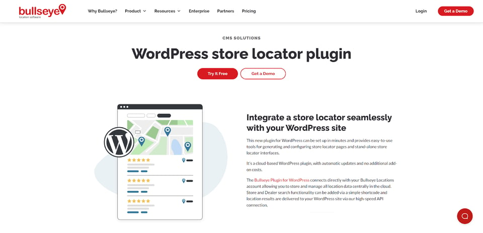
2. Make One of Your Top-Level Pages a Premium Dealer Locator
The best type of site visitor you can have is one who’s ready to buy. This is a lead you don’t want to lose, so it’s key to make their experience as seamless and painless as possible.
One way to do this? Place a dealer locator you’ve built with Bullseye Locations — the best locator solution for building materials manufacturers — in your top navigation bar. By doing this, you’re smartly leveraging your prime digital “real estate” to drive sales.
Let’s say a site visitor simply wants to find out where they can buy your product, as soon as possible. They already know what they need. In this case, you’ll want to point them to your Bullseye-built dealer locator right away.
You’ll accomplish a number of good things by doing this:
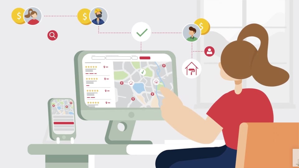
- You’ll be improving your site’s user experience (UX), since your most eager prospects will be able to quickly find the closest brick-and-mortar shop to buy your products from without endless scrolling or browsing.
- You can quickly funnel users to the right dealer or contractor who offers the product lines and value-added services they need, thanks to Bullseye’s list customization options.
- You’ll easily collect customer contact info when they submit their questions or information requests in popup forms, which allows your local dealers and/or sales reps to follow up and create a glide path to the sale.
Don’t make site visitors search for your Bullseye dealer locator! Make it obvious in your navigation bar, using text like “Find a Local Dealer” on a bold-colored button, to instantly take users where they need to be.
3. Implement Drop-Down Menus with Helpful Context
The labels you use in your drop-down menus should be highly descriptive of the content visitors will find within. Rather than labels like “Video” or “Articles”, opt for titles that explain the kinds of information each page will contain, such as the names of specific products or services. Adding context like this to your drop-down menu selections is an excellent way to add clarity.
This way, rather than having to click on a heading, just to be forced to make another selection…your site visitor can get where they want to go quickly, with fewer clicks or taps.
4. Leverage SEO in Your Menus
While the primary focus of your menu design should be the user experience, search engine optimization is also key. With SEO being a key leverage point for building materials manufacturers in 2023, don’t waste any opportunity to earn competitive spots in Google results.
With a little creativity, you should be able to incorporate some targeted keywords in your menu headings. Experiment with different ways of labeling your menu options until you’re properly describing what each link points to, while optimizing your menu for high-volume keywords that are relevant to your products.
5. Use Breadcrumb Navigation
“Breadcrumbs” are simply trails of links that allow site users to follow a clear path back to previous pages. They’re often overlooked in website design, but they can add significantly to the user experience and are easy to implement.
For example, if you’re a plumbing fixture manufacturer, your breadcrumb links might look something like the following:
Home > Shower Systems > Shower Panels > Stainless Steel Shower Panels
Having a trail of links like this at the tops of your pages will help your users explore your various offerings, while also making it easy for them to work back through your site.
Also, with breadcrumbs, a visitor might see a category header they would have missed otherwise. If they land on a product page that’s not quite right for them, the breadcrumb link that takes them back to the main category of interest could end up saving the day!
6. Ensure Your Site Works Well on Every Device
At this point in the development of the internet, mobile-friendly design isn’t negotiable:
- It’s likely more than half of your traffic will come from a phone or tablet. More than 60% of all traffic across the entire web is mobile, according to Exploding Topics.
- Stats cited by Sweor show that more than half of all internet users will hesitate to refer a brand to others if the website fails on mobile.
As a modern building materials manufacturer, what should you do with this info?
First, ensure your mobile website experience is optimal (and even prioritize this over the look and feel of your site’s desktop version). Second, ensure you’re leveraging responsive design. Your site should auto-detect a user’s type of device, and then render your site in a way that best fits their screen.
With Bullseye as your dealer locator solution, you’ll have no issues in these areas. Locators built with Bullseye are designed to work perfectly on mobile devices — so that anyone who lands on your site, with any device, can have an easy experience finding the local dealer or contractor that suits their needs in seconds.
7. Keep Your Design Elements Consistent
Consistency is a core concept in site design. The last thing you want is for your site to look dramatically different from one page to the next…as your users will get confused and may simply leave than bother to figure out what’s going on.
Subconsciously, inconsistent design can even hurt prospects’ trust in your brand.
For those reasons, all the visual aspects of your online brand including fonts, text sizes, logos, and colors are important to monitor when you redesign your site. When making updates, keep your design elements the same from section to section, and ensure that your older web pages aren’t neglected along the way.
To do this right, use a site map to track down every last page that’s active on your domain. From there, it’s much easier to ensure every page adheres to your design standards and navigation layout.
8. Make Sure Everything is Readable
The point of a website is to deliver information to a user. For a building product company, that means sharing key details about products so that potential customers can make educated buying decisions.
To make sure it all gets across to your web visitors without distractions, check your site regularly for any font or color problems that could impact readability.
Why is this important? If color scheme changes are made along the way, and they happen to clash with existing colors, it might suddenly be difficult to understand what your site is saying. Consumers won’t bother trying to figure it out: they’ll simply leave!
As an ongoing principle of site maintenance, go over every webpage to ensure all text is extremely easy to read. If any issues come up, address them immediately to avoid losing valuable leads.
9. Fix Any Navigation Errors, Bugs, or Slow-Loading Pages
Does everything on your site work as it should? When someone clicks on a link or fills out a form, the page element in question should function perfectly every time.
Websites have a way of developing issues over time, making your site’s functionality another thing you’ll need to investigate on an ongoing basis. There are software programs available to help you test your site and find such problems as broken links and 404 errors.
Among the many advantages of using Bullseye for your dealer locator — one of the most important parts of your site to maintain at all times — is the fact you can count on it to perform reliably, year after year. As a cloud SaaS platform backed up by experienced technicians, Bullseye is constantly maintained for stability.
Many other dealer locator tools are known to be buggy and inconsistent. For the highest chance of converting building materials leads to customers whenever they land on your site, you’ll want to stick with a proven industry leader like Bullseye.
10. Refine Site Structure Over Time with Analytics
Collecting data about how people use your site is the best way to make it better over time.
Users of Google Analytics will be able to integrate Bullseye with their GA account to pick up valuable data points about how the locator is being utilized.

Simply looking at a report of the pages that are getting clicked on the most in your menus will provide great insight into what your customers think is important. (It might not always be what you’ve assumed.)
Let your users “tell you” how your site can be improved from a navigation perspective, and then put that valuable data to use. As a result, you’re very likely to see more leads and sales come through your web presence.
Make Your Online Building Materials Brand a Leader with Thoughtful Web Navigation
These days, building materials brands only have moments to create a bond with online consumers. If you don’t grab their attention right away — and keep it — you’ll lose them.
Clunky or awkward navigation could stand in the way of people seeing the information they need to make a decision. This makes website navigation a key part of marketing your brand successfully.
By leveraging a clear top navigation bar, breadcrumbs, mobile-friendly design, and acting on other best practices for site structure and function, you’ll make your website a pleasure to use. That’s not the be-all and end-all, however, for converting web users to buyers.
Adding a Bullseye-built locator to the mix is what takes it all to the next level. Combined with a well-structured site, a premium dealer or contractor locator will drive customers directly to the point of sale, in less time. Bullseye is the tool you need to ensure this happens without a hitch, every time.
Shore up your web navigation, send some eager-to-buy users to your Bullseye locator as soon as they hit your homepage, and see what that does for your sales. If you’re ready to explore the possibilities, schedule your free demo of Bullseye today!