
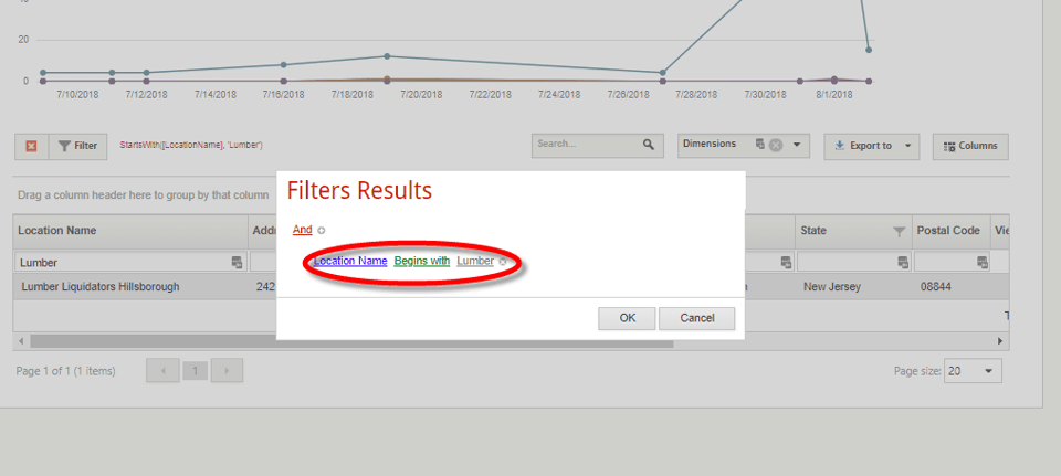
We are very excited to announce that our Map on Top interface is now fully responsive. That’s right, there is no longer a need to include the mobile redirect and have a separate mobile store locator interface. Our upgraded Top Map interface uses fluid grid, flexible images and CSS3 media queries to automatically provide the optimal viewing experience across multiple devices from desktop monitors to mobile phones.
If you already have the Top Map interface, your existing interface will remain the same. However, if your site is already set up as responsive and you’d like to take advantage of the new responsive Bullseye interface, you’ll need to make some minor adjustments in the configuration screen. Here’s how:
-
Log in and go to the Interfaces tab
-
Select your interface
-
Under the General options select “Create responsive interface”
-
Set the Page Max-Width. For a full width interface, leave this blank.
-
Set the Page Height. For full height interface, leave this blank and make sure the parent elements on your page containing the Bullseye interface have height set to 100%.
-
When publishing, you should copy the updated code provided and review the suggestions on the Publish page.
-
Remove the javascript mobile redirection code from the page calling the iFrame.
For detailed instructions on setting up a responsive store locator software interface visit our knowledgebase https://kb.bullseyelocations.com/support/solutions/articles/5000610370-add-a-responsive-interface-to-your-site
If you have any questions, our team is available to help. Contact us through chat or phone (800) 616-1415 from 9-6 EST.
If you are new to responsive design, here are some resources to help you get started.
-
https://www.smashingmagazine.com/responsive-web-design-guidelines-tutorials/
-
https://www.lingulo.com/tutorials/css/how-to-build-a-html5-website-from-scratch
-
https://www.awwwards.com/50-examples-of-responsive-web-design.html
Events, Local Landing Pages, and other Goodies
You can now publish events and create location landing pages. Both features are available to premium subscribers and work with the Map on Top interface. Combine these features with our coupon capabilities and you’ve got a great platform to engage in some serious location-based digital marketing.
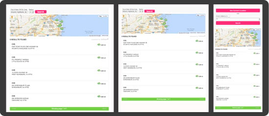
Location landing pages are automatically enabled. Simply check the location landing page option in the interface options page and the location page will link from your search result page. Location landing pages include maps, store hours, links to social media, events and even coupons. They are also fully responsive and will adjust based on the size of the device.
Events can be enabled by going to settings/menu and selecting the events menu item. Once that’s done, events will appear in the left-hand navigation. Adding an event is simple. Just enter the name, location, dates and any descriptive information. You can also include links to a register page, an event photo and social media links. Events are displayed below locations and link to a separate, dynamic event landing page that features the event.
We’ve also slipped a few other goodies into this release. All location data including search results, location landing page and event pages now use NAP markup schema for local businesses to help search engines like Google and Bing recognize location information. We’ve also added a configuration option that lets you modify the height of the map and another option for selecting drop-down menu instead of checkboxes for categories.
More to come soon…